In this post, I talked about working on fixing up the navbar on my Google Blogger blog. It was going okay so far, and, now, I’ve actually finally finished fixing it. Well, at least until I decide to make a few more changes / modifications to it or something.
Remember that screenshot from the navbar post? Yeah, well, let’s just say that my navbar doesn’t really look like that anymore.
Forgot to get a screenshot, but I don’t think it even matters anymore since I might just end up changing my mind anyway (Update: yep, I did end up changing my mind. LOL. For instance, the Movies Meta blog doesn't even have a navbar anymore).
Currently, my navbar now has the following:
So, I kept the title and the menu links, and they still look the same as in the screenshot. But I decided to remove the follow buttons and the “subscribe to the RSS” icon.
I decided that they shouldn’t be on the navbar anymore and will just place them somewhere else.
There’s the search icon and then the word “search” beside it. When you click it, a modal shows up. This modal contains the search box that you can see on the screenshot.
Update: the search box has also changed. For instance, the Anime Meta Archives blog has a full-screen search feature. Once the search icon is clicked, the full-screen search bar will show up.
So far, I think the Google Blogger navbar looks okay now, and I’m so totally done with it. At least, I really hope I’m done with it.
I dunno though. LOL. Who knows, I might decide to add the follow buttons and RSS icon there again or something.
Until then, I’m just gonna say that I’m done with the Google Blogger navbar and can now focus on the right sidebar.
*Notes:
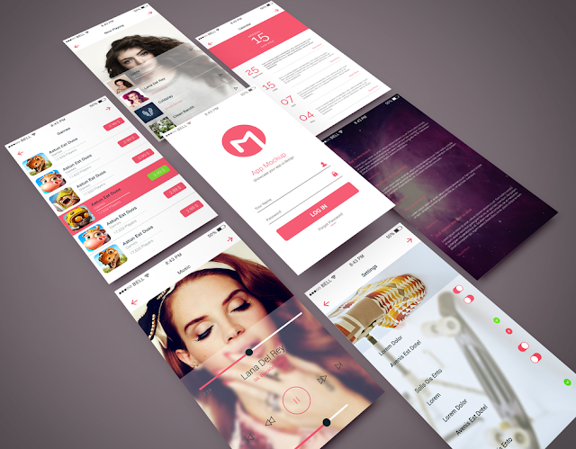
- First image is by GraphBerry (CC:BY-SA) from deviantArt
- This was previously published elsewhere on Sunday, January 1, 2017 at 11:42 AM
Remember that screenshot from the navbar post? Yeah, well, let’s just say that my navbar doesn’t really look like that anymore.
Forgot to get a screenshot, but I don’t think it even matters anymore since I might just end up changing my mind anyway (Update: yep, I did end up changing my mind. LOL. For instance, the Movies Meta blog doesn't even have a navbar anymore).
Currently, my navbar now has the following:
- Blog title
- The menu links (about, contact, categories)
- Search
So, I kept the title and the menu links, and they still look the same as in the screenshot. But I decided to remove the follow buttons and the “subscribe to the RSS” icon.
I decided that they shouldn’t be on the navbar anymore and will just place them somewhere else.
Transformation of the Google Blogger Search Box
As for the search - it’s no longer a search box. It now looks like one of the menu links that you can see on the screenshot.There’s the search icon and then the word “search” beside it. When you click it, a modal shows up. This modal contains the search box that you can see on the screenshot.
Update: the search box has also changed. For instance, the Anime Meta Archives blog has a full-screen search feature. Once the search icon is clicked, the full-screen search bar will show up.
Stop the Google Blogger Navbar from Looking Cluttered
I thought it was better that way so the navbar doesn’t look so cluttered and people will only see the search box when they actually want to use it.So far, I think the Google Blogger navbar looks okay now, and I’m so totally done with it. At least, I really hope I’m done with it.
I dunno though. LOL. Who knows, I might decide to add the follow buttons and RSS icon there again or something.
Until then, I’m just gonna say that I’m done with the Google Blogger navbar and can now focus on the right sidebar.
*Notes:
- First image is by GraphBerry (CC:BY-SA) from deviantArt
- This was previously published elsewhere on Sunday, January 1, 2017 at 11:42 AM


